
If you’re looking to edit pictures professionally, there are various tools and features in GIMP to make your photos look their best. In this article, we’ll show you how to crop and resize photos, adjust the levels, shadows, and highlights, Saturation, and Sharpening, and add Vignette to images.
Different ways to Edit Images in Gimp
The different features available in GIMP give you the opportunity to enhance your images.
Are you interested in learning how to edit photographs professionally in GIMP? If so, you’ve come to the right place! In this article, we’ll show you some of the tools and filters available:
- Levels Adjustment
- Shadows-Highlights Filter
- Saturation Adjustment
- Heal Tool
- Sharpen Filter (UnSharp Mask)
- Crop Tool
- Vignette Filter
- Scale Tool
Setting up the Document
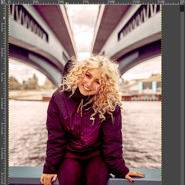
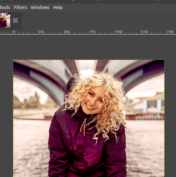
Step 01: Open an image
Initially, you are required to open the image to start editing. To open an image in GIMP,
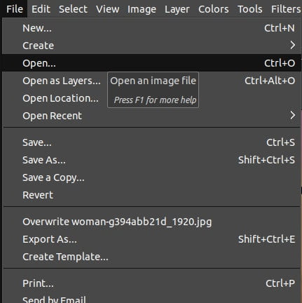
- Simply go to the File menu. Choose the Open option.
- Alternatively, press Ctrl/Cmd+O.
- Also, you can drag and drop the image to the GIMP workspace.
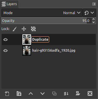
Step 02: Duplicate the layer
The first photo editing tool we will use is the Levels adjustment. A Levels Adjustment is used to change the brightness/contrast of the image based on different colors such as Red, Green, and Blue.
The best practice is to duplicate the layers before you start working on them. This is to ensure that the original image remains unmodified. To duplicate the layer,
- Go to the Layers Dialog on the right-hand side of the screen.
- Click on the Duplicate icon.
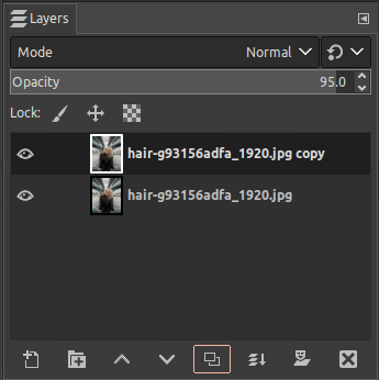
- Once you click on it, the duplicate layer would appear.
- Simply, double-click on the duplicated layer and rename it as desired.
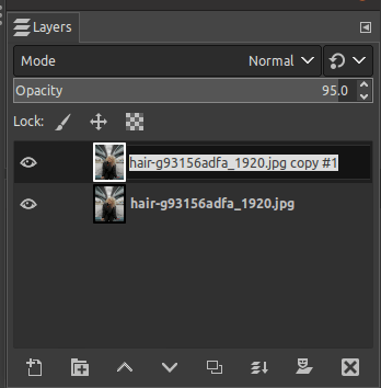
- Once you rename it, press the enter button to save the changes.
1: Levels Adjustment
Click on the duplicated layer from the Layers Dialog to apply a Levels adjustment.
- Go to the Colors menu.
- Click on the Levels option.
- As soon as you click, the Levels dialog appears. Here, you can move the sliders to the left and to the right according to your preference.
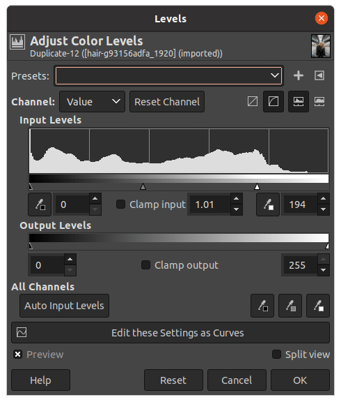
There are four channels in the Levels dialog as displayed below,
- Value
- Red
- Green
- Blue
Let’s discuss how to use each channel separately.
Value
Go to the Channel drop-down menu and ensure that the option picked is “Value”. Value is the default option chosen for the Levels adjustment.
The Value channel lets you adjust the brightness and contrast in your image. The section under Input Levels displays the histogram with details of the image. You can also see three triangles right below the histogram. The three triangles depict the Black, Gray, and White colors.
You can drag those triangles to adjust the values of the pixels depending on which colour you choose.
- If you drag the black triangle to the right, it increases the black pixels in the image. This would create a darker image as well.
- The white triangle would increase the white tones in the image. For example, if you move it to the right, the image is brightened automatically.
- The gray triangle will automatically move in the same direction to where you drag the other triangles. This is to compensate for the amount of darkness and lightness in your image. If you drag the grey triangle yourself, the pixels will change according to the range of colours. For example, if you drag the slider to the right, the pixels of that range will become darker.
- As you move the sliders, you can see the changes in the image right away.
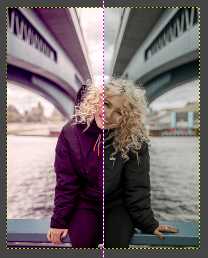
In this image, you can notice that the black pixels are slightly increased to correspond with the gray and white pixels. The gray and white triangles are adjusted accordingly as well.
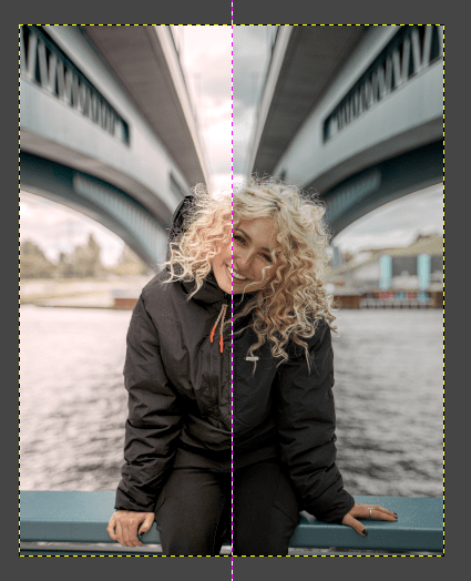
Once you have made the changes, enable the Split view option from the same Levels dialog. It helps to compare the new(edited) and the old image. You can notice the changes clearly as displayed below.
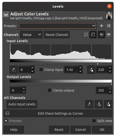
Red Channel
When adjusting the Red Channel, you are either adding or removing the amount of red from an image. Generally, if you remove the red color, a cyan color is added to the image. To find the Red channel,
- Click on the arrow next to the Channel setting.
- Choose the Red option from the drop-down menu.
You can notice that the histogram shows the red tones in your image. This is how to adjust the Red channel,
- To add red highlights, move the slider to the left.
- To add a red mid-tone, move the slider to the left.
- To add red contrast, move the slider to the right.
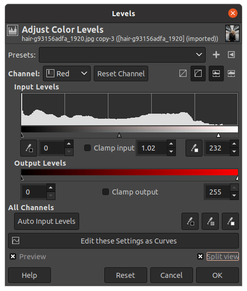
In this image, the red contrast is increased a bit instead of adding too much red color into the image.
Once after editing, the split view is activated to display the new(edited) and old images as follows:
Green Channel
While using the color pixels, you are either adding or removing green color in the image. Generally, if you remove the green color, the magenta color is added to the image. To change to the Green channel,
- Click the channel drop-down.
- Choose the Green option.
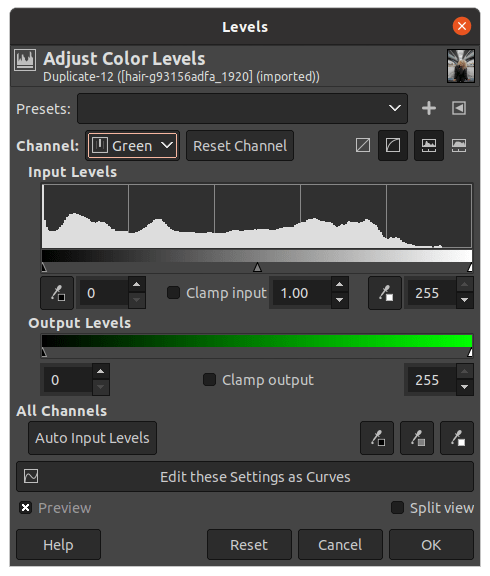
You can notice that the histogram shows the green colors in the image using the bars. This is how to adjust the green channel:
- To add green highlights, move the slider to the left.
- To add a green mid-tone, move the slider to the left.
- To add green contrast, move the slider to the right.
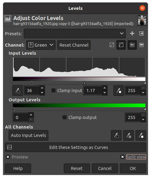
In this image, the green highlights are increased slightly to correspond with the red highlight. Also, the green mid-tone is decreased slightly as well.
Below is the split view after adding making changes to the green channel.
Blue Channel
While using the blue color pixels, you are either adding or removing Blue color in the image. Generally, if you remove the Blue color, the yellow color is added to the image. To change to the Blue channel:
- Click the channel drop-down.
- Choose the Blue.
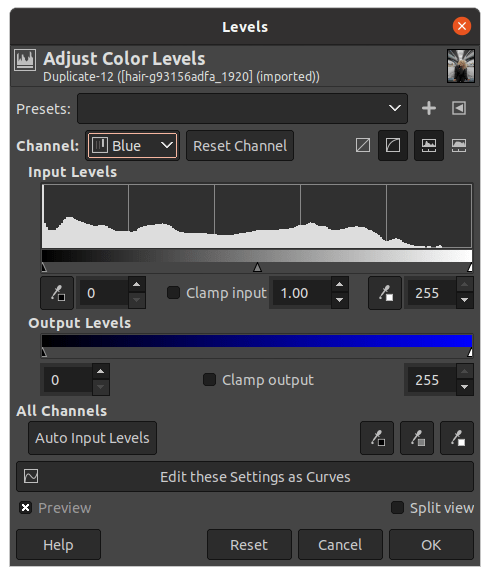
You can notice that the histogram shows the Blue colors in the image using the bars. This image has fewer blue color pixels based on the histogram chart. This is how to adjust the blue channel,
- To add Blue highlights, move the slider to the left.
- To add a Blue mid-tone, move the slider to the left.
- To add Blue contrast, move the slider to the right.
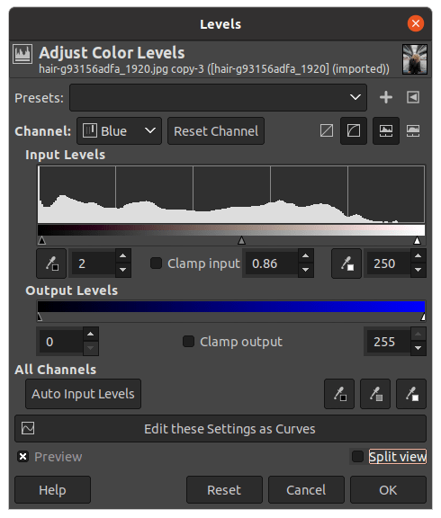
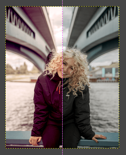
In this image, the blue mid-tone is decreased slightly to give a better look to the image. After editing the image with the blue channel, below is the split view of the new(edited) and the old image.
Once you have applied these changes, simply click OK in the dialog box. This is how you adjust the Levels adjustment for professional editing.
By using the Levels adjustment, the Value, Red, Green, and Blue pixels are adjusted accordingly to create a better outlook of the image.
2: Use Shadows-Highlights Filter
As the name suggests, the Shadows-Highlights Filter gives you the ability to adjust the shadow and highlights in your image. The three groups of sliders available consist of:
- Shadows
- Highlights
- Common
By learning how to use the Shadows-Highlights Filter, you can control the contrast of your photos. In order to apply the Shadows-Highlights filter:
- Go to the Colors menu.
- Click the Shadows-Highlights option.
- Once you click on it, the Shadows-Highlights dialog appears. Here, you can use the sliders of the highlights, shadows, and white point adjustments to adjust the shadows and highlights.

As soon as you click on the Shadow-Highlights option, the below dialog appears with three distinct settings.
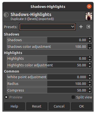
What is the “Shadows” Slider?
The Shadows Slider is used to lighten and darken the shadows in the image. The higher the value, the lighter the shadows become, and vice versa.
The Shadows Colour Adjustment Slider determines the color saturation of the shadows in the image. Lower values will minimise the saturation of the colors on lightened shadows. Higher values would result in the enhancement of the saturation of lightened shadows.
These can be useful if you want to control the exposure of shadows in your image.
Highlights
As opposed to the Shadows filter, the Highlights Slider brightens or darkens the highlights in an image. The higher the value, the brighter the image becomes.
The Highlights Colour Adjustment Slider allows you to adjust the colour saturation of the highlights in the picture. By dragging the slider to the left, darkened highlights would be desaturated while moving the slider to the right would brighten them.
The Highlights sliders give you full control over the highlights in your image.
Common
The three sliders of the Common group pertain to both Shadows and Highlights.
The White point adjustment allows you to adjust the overall brightness of an image by controlling the amount of Black and White pixels in the image. This can be useful if you want to make a photo look lighter or darker.
- If the white point value is greater than 0, the image becomes brighter.
- If the white point value is lesser than 0, the image becomes darker.
The Radius slider gives you control over the range of the filter applied. The lower the value, the harder the transitions between the shadows and highlights in the image. With a high radius, the transitions would be softer. Be careful not to increase the radius too much because the photo may become blurred.
The Compress Slider is there to protect the mid-tones in your image. Dragging the slider to the right would diminish the effect of excessive shadows and highlights. Moving the slide to the other side would extend the changes made to the mid-tones as well.
- The shadow is increased to 61 to deepen the shadow within the image.
- Next, the highlights are decreased to -33 to avoid overexposure.
- Finally, the White point is increased to 2 to increase the brightness of the image.
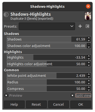
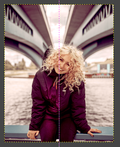
After making the changes, the following is the result of adding a Shadows-Highlights filter to the image.
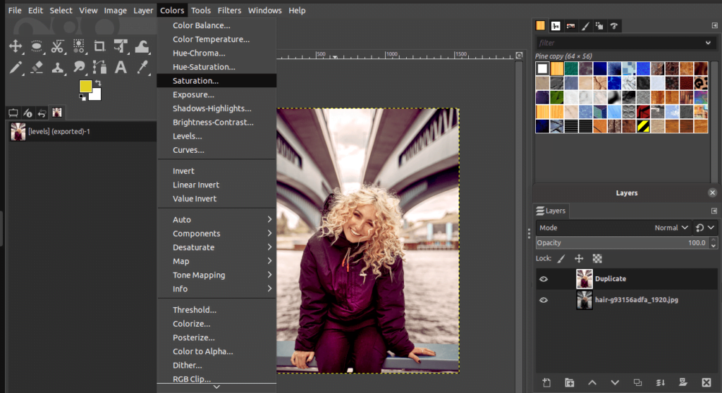
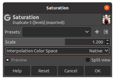
3: Use Saturation adjustment
Saturation refers to the intensity of colors in an image. The more saturated a color is, the more vibrant it appears. The less saturated a color is, the duller it appears. To find the Saturation adjustment:
- Go to the Colors menu.
- Click the Saturation option.
- Once you click, the Saturation dialog appears. Here, you can adjust the Scale slider to reduce and increase the Saturation accordingly.
There are three options to choose from in this dialog:
- Native
- CIE Lab/Lch
- CIE Yuv
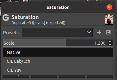
It is recommended to choose the Native option to maintain smooth and effective editing. You can use the Scale slider as so:
- To increase the saturation, move the slider to the right.
- To decrease the saturation, move the slider to the left.
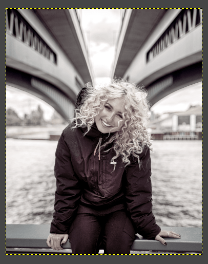
By using the Scale slider, you can make colors appear more vivid or muted, depending on your desired effect. If you drag the Scale slider to the left, you will see that the photo will become black-and-white as displayed below.
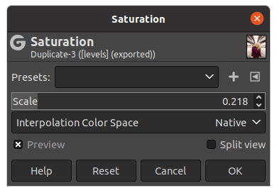
If you prefer a black-and-white image, simply pull the Scale slider to the left. The following is the resulting image after decreasing the Saturation Scale.
As shown below, the Scale slider is now dragged to the right to increase the intensity of the colors. This will give life to the colors and enhance the overall image.
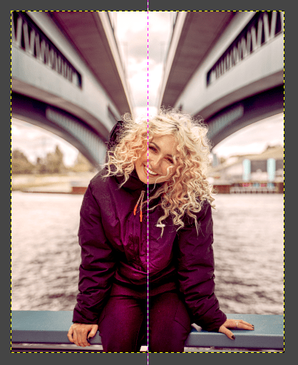
When you’re ready, enable Split View to display the new (edited) and the original image side-by-side.
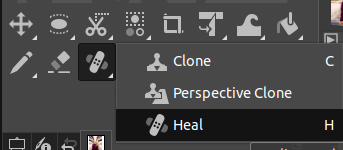
4: Use the Heal tool
The Heal tool is one of the most powerful tools in GIMP. It can be used to heal spots, scars, and other blemishes in an image. When using the Heal tool, it is important to be careful not to overdo it. If you heal too much, you can end up with an unnatural-looking image.
To select the Heal tool,
- Go to the Toolbox on the left-hand side. Right-click on the below-displayed icon and choose Heal. The icon looks like a band-aid.
- Alternatively, use the keyboard shortcut “H” to select the Heal tool.
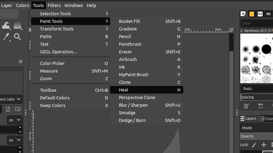
Alternatively,
- Go to the Tools menu.
- Choose Paint tools.
- Pick the Heal tool.
The best way to use the Heal tool is to zoom in on the area you want to fix, and then carefully brush over the blemish. To zoom in:
- Simply use the Ctrl/Cmd+scroll your mouse to zoom into the desired section of the image.
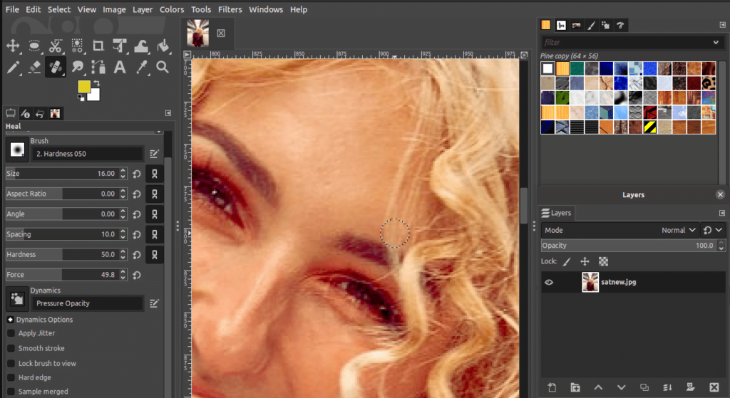
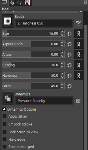
Also, make sure to have a brush with a hardness of 50 or lesser for better healing effects. You can adjust the brush settings from the Paintbrush tool options on the left-hand side of the canvas.
Also, set the Dynamics option to “Pressure opacity”. Adjust the other settings such as spacing, hardness, and force as per your requirements.
You can also adjust the brush size by pressing the keys “[” or “]” to ensure the healing spot and the brush size are identical. The Heal tool will automatically clone nearby pixels and blend them into the area you are healing.
If done correctly, the healed area should look natural and unnoticeable. So don’t be afraid to experiment with the Heal tool until you get the results you want!
5: Use the Sharpen filter (unSharp mask)
The Sharpen mask is one of the most commonly used tools in GIMP. There are various ways to sharpen an image, but this is a very easy and effective method to accentuate an image in a few clicks.
To choose the Sharpen option,
- Click on the Filters menu.
- Choose the Enhance.
- Finally, click on Sharpen (Unsharp mask).
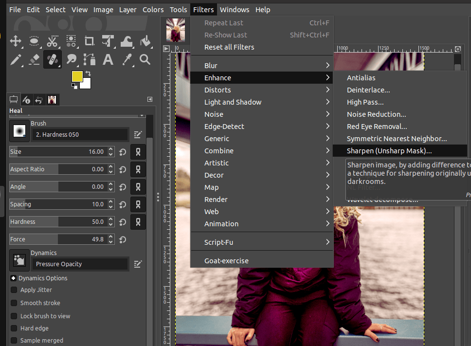
A dialog with a few options to adjust the Sharpen filter (Unsharp mask) will pop up.
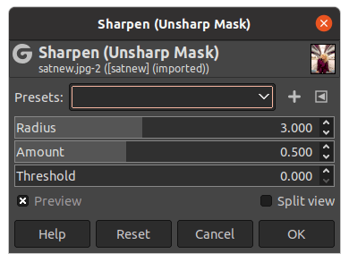
The Sharpen filter is a great way to improve the overall quality of an image. The options are displayed as follows:
- Radius: Controls the amount of pixels that will be affected by the filter.
- Amount: Adjusts the strength of the sharpening.
- Threshold: Controls the difference in pixels values affected by the filter. The lower the tolerance, the less variance between the target pixels and the selected pixels will be allowed. The higher the tolerance, the more varied the pixels which will be affected by the filter.
If you require a smaller resolution for the image, simply use the following settings:
- Radius: 3.0
- Amount: 0.5
- Threshold: 0
If you require a higher resolution for the image, simply use the following settings:
- Radius: 4.5
- Amount: 1.0
- Threshold: Depends on the requirements
For this image, the smaller resolution settings are used to get the below-brightened effect.
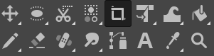
6: Use the Crop tool
Cropping images is a fairly simple process in GIMP, and only requires a few steps. Then, to select the Crop tool,
- Select the Crop tool from the Toolbox.
- You can also press the “C” key on your keyboard to select the Crop tool.
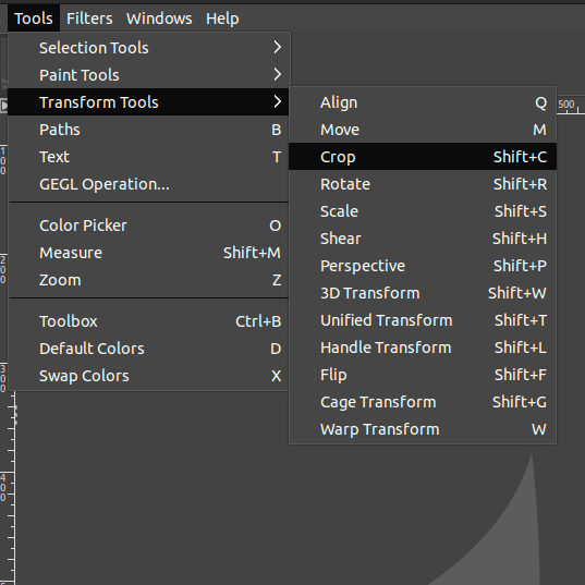
Alternatively,
- Go to the Tools menu.
- Choose the Transform tools.
- Click the Crop tool.
Now, click and drag on the image to select the area you want to keep and the portions you wish to cut out. Adjust the preferred settings in the Crop tool settings displayed on the left-hand side.
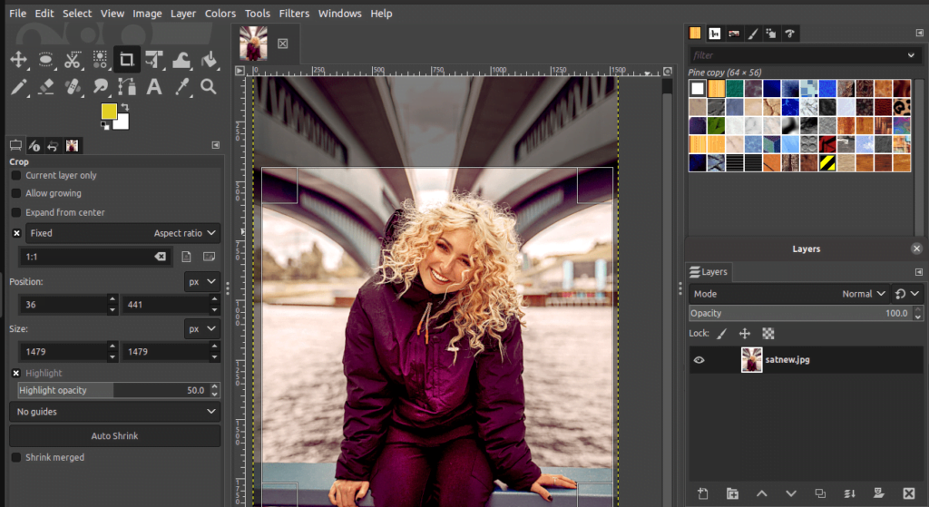
When you’re happy with your selection, click inside the cropped area to simply crop the image.
7: Apply a Vignette filter
The Vignette filter is a great way to draw attention to the subject in an image. By darkening the edges of your photo, you can create a more vibrant and striking look. This effect is perfect for photos that are otherwise dull or flat. To start applying Vignette, create a new layer as per the below instructions,
- Go to the Layers menu.
- Click New Layer.
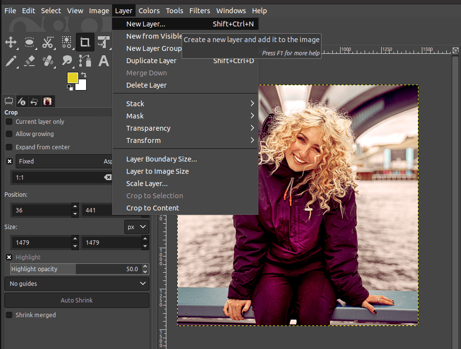
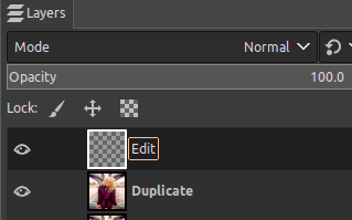
As soon as the new layer is created, it will be displayed in the Layers tab on the right-hand side. You can double-click to rename the specific layer. Here, it is renamed as “Edit” as shown below.
Add the Vignette effect by selecting the transparent layer and,
- Go to the “Filters” menu and select “Light and Shadow.”
- Next, choose the Vignette option.
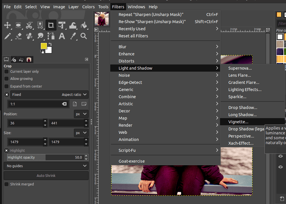
A dialog with multiple settings to adjust the Vignette filter will appear.
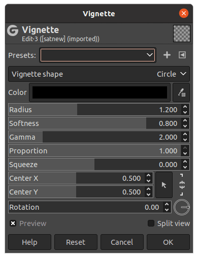
You can then adjust each effect by sliding the slider to the right or left.
- Color: Let you choose the preferred Vignette color.
- Radius: Helps to increase or decrease the range of pixels affected by the filter.
- Softer: Makes the edges of the vignette softer.
- Gamma: Determines the descent of the curve from the centre to the periphery. This basically controls how the brightness falls off from the edges.
- Proportion slider: Sets the proportion (shape)of the vignette.
- Squeeze: Squeezes the vignette and this changes the shape of the vignette.
- Center X or Center Y: Adjusts the center point of the vignette.
- Rotation slider: Rotates the vignette along the center.
The following are the settings applied to this image. Only a few settings such as Radius, Softness, and Gamma were changed.
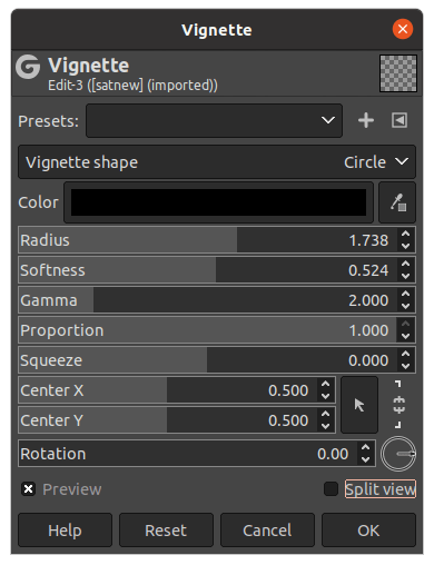
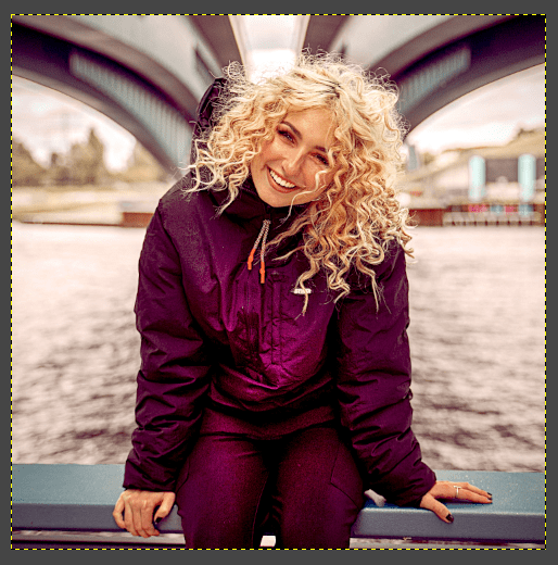
Once you have made the changes, simply click OK. Then, view the vignette effect applied to the image.
Experiment with the different settings until you find a look that you like.
8: Scale Tool
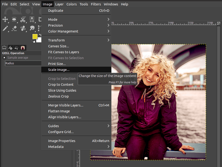
The Scale tool in GIMP can help you resize your images. Here’s a quick guide on how to use it. To scale the image:
- Go to the Image menu.
- Click on Scale Image.
Then, click and drag one of the corner handles to resize the image. You can also enter specific width and height values in the Scale Image dialogue that appears.
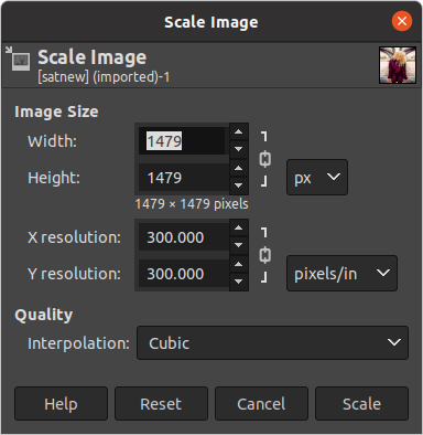
If you want to retain the aspect ratio of your image while resizing, make sure that the chain icon between the width and height values is locked.

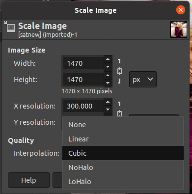
There are four main options to select in the Interpolation Method: Linear, Cubic, NoHalo, and Lohalo. This is the way the missing pixels are calculated in case you wish to enlarge an image.
In this example, we will choose Cubic.
Once you’re happy with your new image dimensions, click scale to resize your image.
Save & Export the image
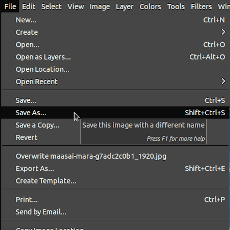
In order to save an image in GIMP,
- Go to the File menu.
- Choose Save As.
In the window that pops up, type a new name to save the file, go to the location where you want to save it, and choose the file format in which you want to save the image. Generally, images are saved in XCF format. Finally, click Save.
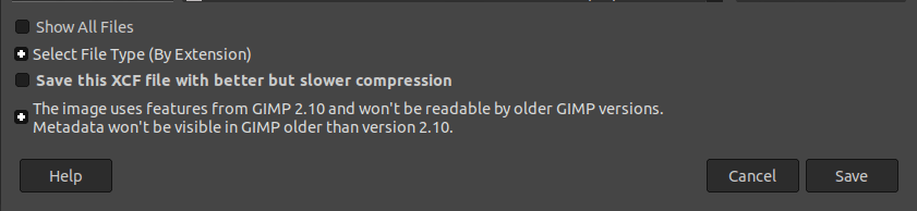
That’s it! Now your image is saved in the chosen file format.
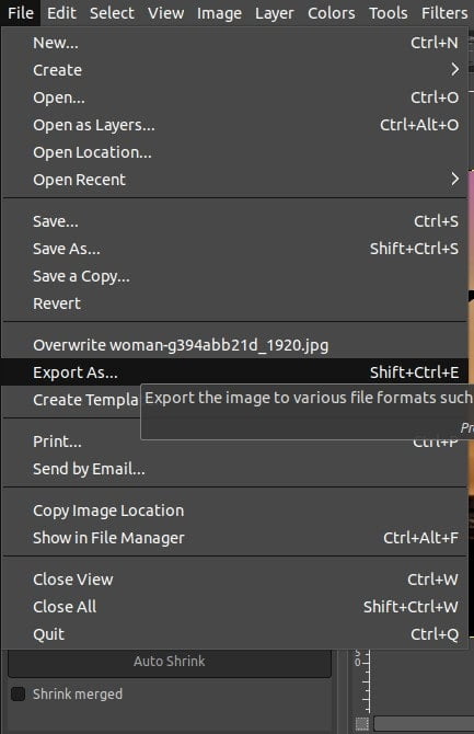
Export the image
To export an image in GIMP,
- Go to the File menu.
- Next, click Export As.
In the Export Image window, select the file format you want from the drop-down list. It is recommended to use the JPEG format as displayed below.
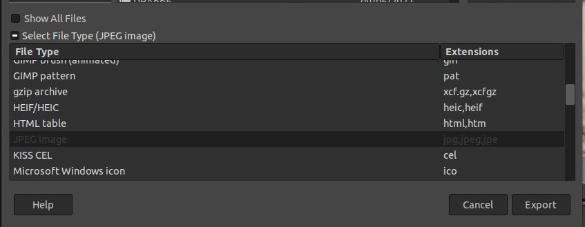
You can also change the name of the file and choose where you want to save it. Once you have everything set up, click on Export.
GIMP supports a wide range of file formats, so you can choose the one that best suits your needs.
Conclusion
In conclusion, following these steps will help you enhance your images in GIMP. It is not compulsory to use all these editing features. You can pick the best ones and use them as per your requirement.
Anyone can do it with a little bit of practice. So, go ahead and get started!
Thanks for reading & feel free to check out more of our articles!
Expert Rating
Summary
The tools and filters above display just a few of the possibilities and capabilities of GIMP. It is not absolutely necessary to master all of the capabilities of an image editing software, however, the more knowledge and skills a graphic designer possesses, the better equipped they would be to produce quality work and design. The skills above are not very difficult to practise and master and find a wide variety of scalability and functionality in design work.


